
Analyzing and visualizing my sleep tracked from my Fitbit in R
Fitbit has an excellent app and a beautiful dashboard to analyse your activity. But as an Analytics geek I could not get my hands off the possibility to use the Fitbit API to analyze the data and make some visualizations myself. One of the activities I played with is sleep. The Fitbit tracks several subjects that tell something about your sleep like the times you are restless, times you woke up and the actual time you are sleeping. These are the subjects I used to make two visualizations. After importing and preparing the data in R, I used the fitbitScraper package to load the Fitbit data into R and the ggplot2 package to visualize the quality of my sleep for like half a year.
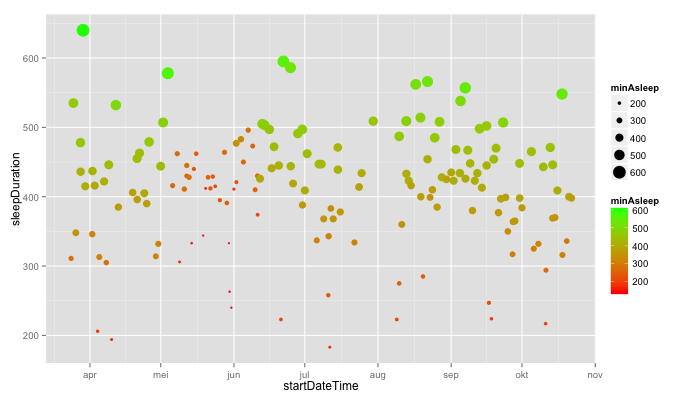
Sleep time – and minutes actually asleep
Notice that the quality of my sleep was quite poor between may (mei) and june. What I would like to see is a lot of big green dots high in the chart.
The next visualization provides this information in addition with the times I get restless during my sleep.
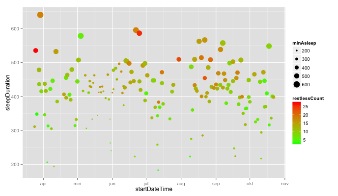 The colors in the chart indicate how many times I am restless. Overall, you can see the longer I sleep the more times I am restless. So it is not the case that I am less restless if I am longer in bed. In some cases you can see that I am quite restless even if I am asleep for a short period of time, which is kind of bad news. There are also points where the quality of my sleep was very good. These are the light green points that are quite large around the area of 400 minutes.
This case show the flexibilty of R to import data from the API of a wearable, prepare the data and make useful visualisations. For questions about the methodology or the script I used, you can mail me at twigt.arie@gmail.com. Sleep well guys :)!

Plaats een reactie